
Apollo 24/7 | Redesigning Trust Into India's Doctor Booking Experience
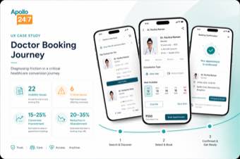
Booking a doctor on Apollo 24/7 was spread across search, profiles, scheduling, and payment.
The fragmented journey created drop-off, reduced trust, and cost the business potential bookings.
Role
Lead UX Manager
Timeline
12 weeks - heuristic evaluation & redesign - 2024
Team
1 UX Designers
1 UX Researcher
1 UX Writer
Primary metric
27% ↑ appointment conversion
₹18.6 Cr projected annual impact
OVERVIEW
The snapshot
Challenge
Despite a strong brand and wide network, booking a doctor on Apollo 24/7 was fragmented and frustrating.
Inconsistent search, incomplete profiles, confusing slots, and a complex payment flow drove 40–60% drop-off across the journey, with appointment no-shows above 22%.
Approach
Led a 12-week heuristic evaluation and mixed-method research engagement with 58 participants, including patients, doctors, support agents, and stakeholders.
Used interviews, contextual inquiry, journey mapping, and competitive benchmarking to identify friction across the end-to-end booking journey.
Result
Redesigned search, doctor profiles, scheduling, and payment into one guided journey. Increased appointment conversion from 15.2% to 19.3%, improved booking completion from 68% to 89%, and reduced abandonment by 41%.
HERO METRIC
27%
Increase in appointment conversion
PROBLEM
What was breaking
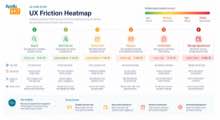
Booking drop-off ran 40–60% across the journey, with a 22%+ appointment no-show rate
68% of users modified their search two or more times, and 30–35% never found the right doctor through search
Users repeated the same information across touchpoints, driving 1.8M+ support interactions per month
Great care. Hard to book.
DISCOVERY
How I learned it
Kickoff, planning & heuristic review (Weeks 1–2)
58 stakeholder, patient, doctor & support interviews (Weeks 3–5)
Journey mapping, service blueprinting & affinity synthesis (Weeks 6–8)
Opportunity prioritization, concept validation & final report (Weeks 9–12)
68% of users modified their search two or more times, and 42% left the app to find doctors elsewhere
Found in behavioral analytics & journey heat-mapping (Search Friction, opportunity score 9.2/10)
61% of users scanned reviews extensively and 47% looked for hospital or background info, but low clarity kept confidence low
Found in patient interviews & journey heat-mapping (Trust & Credibility Gaps, opportunity score 8.9/10)
56% of users switched doctors due to slot unavailability, and 38% abandoned during slot selection
Found in survey responses & contextual inquiry (88% confidence)
INSIGHTS
The moments things clicked
Search friction is the single biggest opportunity
68% of users modified their search two or more times and 42% left the app to find a doctor elsewhere - irrelevant results and unclear filters were the top complaint.
Trust has to be earned before a booking happens
61% of users scanned reviews extensively and 47% looked for hospital or background info, but limited detail and low transparency left them unsure the doctor was right for them.
Staff are overwhelmed and lack actionable clarity
56% of users switched doctors due to slot unavailability, and 38% abandoned mid slot-selection because of unclear consultation types and confusing step counts.
STRATEGY
How I chose what to build
A compliance workflow so confusing, 1 in 3 users abandoned it mid-form.
A compliance workflow so confusing, 1 in 3 users abandoned it mid-form.
A compliance workflow so confusing, 1 in 3 users abandoned it mid-form.
A compliance workflow so confusing, 1 in 3 users abandoned it mid-form.
A compliance workflow so confusing, 1 in 3 users abandoned it mid-form.
A compliance workflow so confusing, 1 in 3 users abandoned it mid-form.
THE TRADE OFF
A compliance workflow so confusing, 1 in 3 users abandoned it mid-form.
SOLUTION
The final shape of things
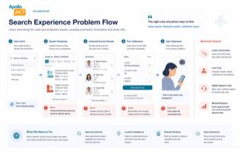
1
Search that understands what you need, not just what you type
We replaced a single generic search bar with popular specialties, recent searches, and AI-ranked doctor recommendations, so patients reach the right doctor in fewer taps and fewer dead-end results.
2
One profile, every trust signal upfront
The redesigned doctor profile surfaces verified badges, fees, experience, languages, and real-time slot availability together, replacing a cluttered layout with a clear hierarchy that shortens the way from profile to booked slot.
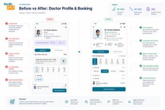
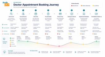
3
A booking journey patients can follow start to finish
Search, scheduling, payment, and confirmation now flow as one continuous journey with proactive reminders and follow-up care, closing the loop that used to end at a static confirmation screen.
IMPACT
What actually shifted

27%
Appointment conversion (15.2% → 19.3%)

32%
Booking completion (68% → 89%)
41%
Abandonment rate (31.5% → 18.5%)

26%
Support ticket volume
BEFORE
15.2% appointment conversion rate
6.2 minutes average time to book
124 support tickets per 1,000 bookings
AFTER
19.3% appointment conversion rate
3.8 minutes average time to book
92 support tickets per 1,000 bookings
REFLECTION
What I'd carry forward
What I'd do differently
I'd have brought Payments & Checkout into the first prioritization wave instead of the fourth - it scored 7.8 out of 10 on opportunity, but we sequenced it behind search and scheduling, and in hindsight the 33% drop-off right at the payment step deserved to move in lockstep with the other quick wins, not follow them.
What this taught me
Every friction point we found traced back to the same root cause: fragmented trust, not fragmented screens. Search, scheduling, and payments all failed for the same reason - patients couldn't tell if the system had their back. Once we treated trust as the product, not a feature, the metrics followed.